The app can get a search bar that looks the same as the one in the Play Store
Abstract
- Google is working on visual updates to its Contacts app, and the search bar is the latest.
- The search bar is being revamped to resemble the one in the Play Store, with a smaller bar that doesn’t span the entire width.
- Multiple app design changes hint at a larger overhaul Google may be planning for its apps.
Google has been working on some redesigned elements in its Contacts app for a while now. It looks like the next element in line is to revamp the search bars at the top. Google is currently testing a redesign that brings it more in line with the Play Store. However, the new look hasn’t been rolled out yet, so it may take some time for it to arrive on your phone.

Your Google Contacts could soon look a lot less messy
Messaging and calling options now default to only one line per service for some
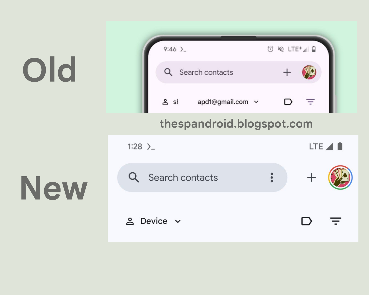
The redesign makes the search bar smaller, removing the account switcher and the plus button. Instead, these options sit next to the search bar, which now only includes a new three-dot overflow menu on the right. In the past, the search bar included both an account switcher and a plus button, although for some people there was always an extra menu instead of a plus button. The new design separates different features more clearly, making it easier to understand what each interface element is responsible for.
Source: TheSpAndroid
The redesign is not active yet and is still hidden behind flags, which can only be activated on rooted Android devices. AssembleDebug spotted it in development at TheSpAndroid. Since the new design looks pretty complete, it may only be a matter of time before Google launches it, but as with any development like this that’s spotted early, the company could also scrap it entirely if it’s not happy with it.
The redesign could be a hint of a broader strategy
All Google apps gradually got the characteristic search bar that runs across the top of the app, but it seems that the company is slowly moving away from this design. A similar small search bar has long existed in the Play Store, and the Google Messages app has removed the search bar entirely in favor of a more branded header with a signature G icon in the top left corner.
It’s possible that Google has bigger updates planned for its app design, now that Material Design 3 and Material You are largely unchanged from Android 12. We may hear more about Google’s plans at Google I/O in May.

